Colour is the fastest communication channel available to a stand designer. This channel operates well below the threshold of conscious attention, making impressions in milliseconds.
Before a visitor reads your headline, absorbs your proposition, or makes eye contact with your team, they have already formed an emotional response to your stand based largely on its palette.
Understanding what that response is likely to be and designing for it deliberately, rather than defaulting to brand colours without interrogating whether they serve the exhibition context, is one of the higher-leverage improvements available in stand design.
How Colour Works on the Show Floor
Exhibition halls are complex visual environments. Dozens of stands compete simultaneously for attention, most of them using their brand colours, which means the aggregate palette of a busy show floor is often chaotic and visually noisy.
The stands that stand out most effectively are not always the brightest or the most colourful. They are the ones that have made a deliberate and considered decision about how their palette relates to the environment around them. They create contrast, calm, or intensity in a way that is purposeful rather than accidental.
The psychological effects of colour are not universal (varying with cultural context, audience demographics, and industry conventions and more), but within the context of the UK B2B exhibition market, several patterns are consistent and worth understanding.
What the Major Colour Families Communicate in a B2B Context
Blue
Blue is the dominant colour in B2B exhibition design, and for good reason. Blue communicates trust, stability, competence, and reliability; exactly the qualities most B2B buyers are looking for in a supplier relationship.
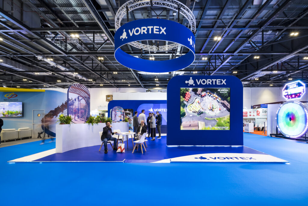
The risk with blue is that it is so ubiquitous in certain sectors (technology, financial services, professional services), that it provides no differentiation on a show floor where every stand is some shade of navy or corporate teal.
If your sector’s exhibition floor is predominantly blue, a considered departure from the family can be more effective than competing within it.
Green
Green communicates growth, sustainability, and naturalness. Its connotations have strengthened significantly as environmental credentials have become a genuine purchasing consideration for many B2B buyers.

For businesses where sustainability is a genuine differentiator, green used thoughtfully communicates alignment with those values before a word is read.
The risk is that light or lime greens can read as lacking seriousness in contexts where gravitas matters.
Black & Dark Palettes
Dark, minimal palettes communicate premium positioning, confidence, and sophistication.
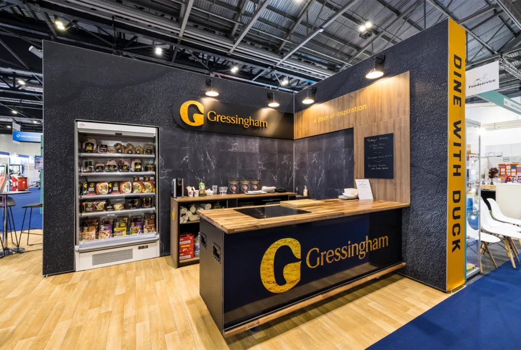
On a show floor dominated by colourful, busy stands, a largely black stand with high-contrast accent elements creates a visual authority and stillness that draws attention precisely because of its restraint.
This palette works particularly well for technology, creative services, and luxury-adjacent B2B categories. It requires exceptional graphic execution to avoid reading as gloomy or cold.
Orange & Red
High-energy, high-contrast colours that create immediate visual impact and communicate energy, boldness, and urgency.
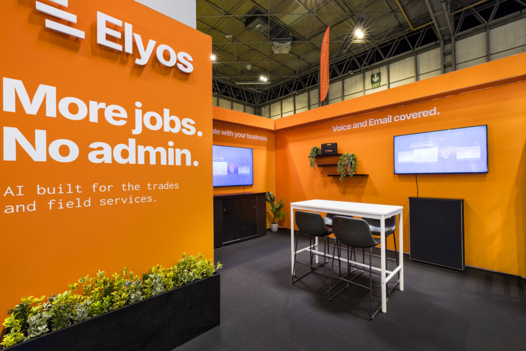
These palettes stop people, which is their primary function. The risk is that they can feel aggressive in contexts where considered relationship-building is the tone required.
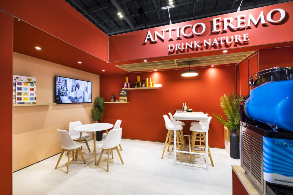
Used as accent colours against a more neutral base, they work very effectively to draw the eye to specific focal points.
White and very light palettes
Clean, minimal palettes communicate clarity, confidence, and (in the right context) premium positioning. They also photograph exceptionally well, which matters for social content captured on the show floor.
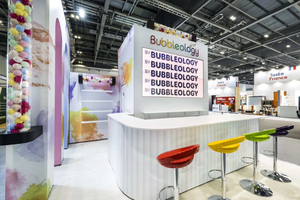
The practical challenge is that white stands show wear quickly during a multi-day show and require careful materials specification to maintain their intended impression throughout.
The Contrast Principle
Whatever palette you choose, the most important design principle on a busy show floor is contrast; both internal contrast within the stand and external contrast with the environment around it.
A stand where everything is the same tone, however carefully chosen, loses visual hierarchy and becomes harder to read from a distance. A stand where one or two elements are deliberately high-contrast creates clear focal points that work at aisle distance, before the visitor has decided to approach.
External contrast (relating your palette to what surrounds you on the floor) requires knowing your neighbours, which requires seeing the floor plan and understanding which exhibitors are in adjacent spaces.
This is information worth getting from the organiser before your stand design is finalised, and it is a conversation your designer should be initiating.
When to Override Your Brand Colour Guidelines
Brand colour guidelines are designed for contexts where consistency and recognition are the primary goals. The exhibition floor introduces an additional goal, differentiation from everything immediately around you, that brand guidelines were not written to address.
In some cases, the most on-brand decision is to use your brand palette exactly as specified. In others, particularly where your brand colours are common in your sector, a creative extension of the palette EG. using your brand colours as accents within a deliberately different base, will serve your exhibition objectives better.
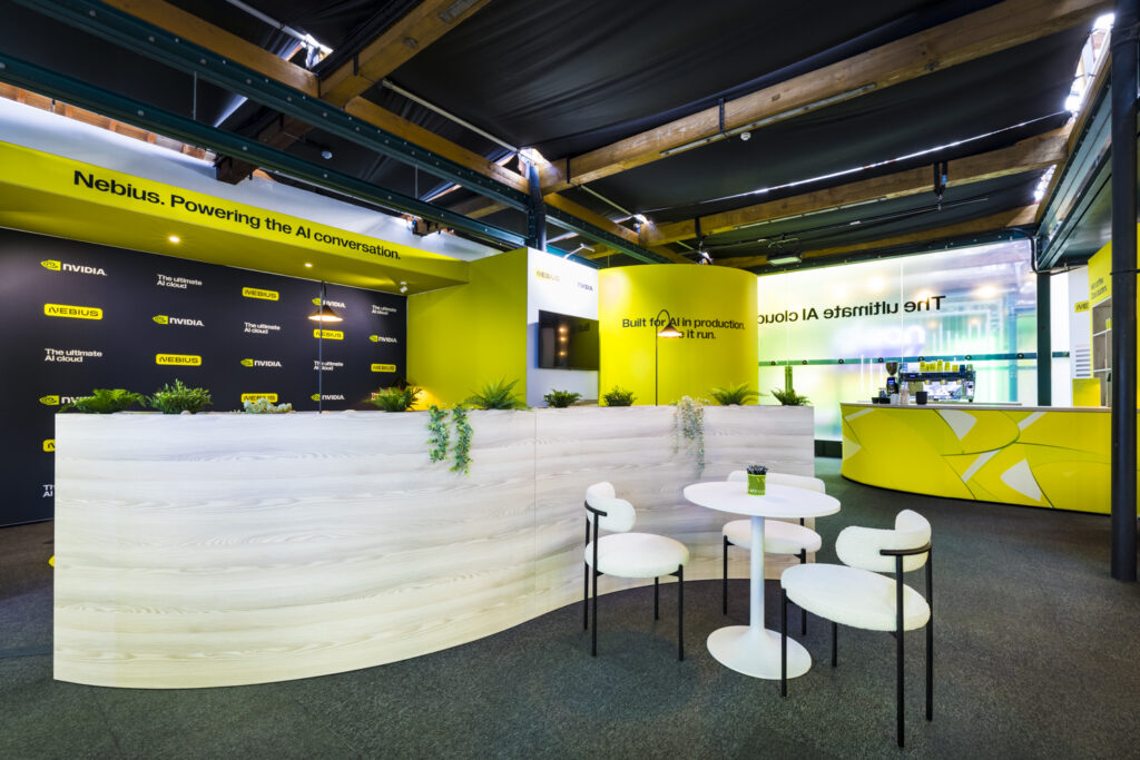
This is a conversation worth having explicitly with your designer and your brand team early in the brief, rather than defaulting to brand guidelines without interrogating whether they serve the specific context of the show floor.
The Practical Design Implication
Before finalising any stand palette, ask these three questions:
• What emotional response do we want a visitor to have in the two seconds before they consciously register our stand?
• What is the dominant palette of our sector’s typical show floor, and how does our colour choice relate to it?
• What is the palette of our specific stand neighbours likely to be, and how do we create purposeful contrast?
The answers will not always change your palette significantly, but they will ensure the decision is deliberate rather than habitual.
Tecna‘s design team approaches colour as a strategic decision, not an aesthetic default.
If you are briefing a stand and want to think through how your palette can work harder on the show floor, it is a conversation we enjoy having early in the process. Click below to talk to our team of experts, and how we can help create your vision.
Book a call with our team today!