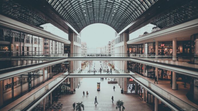
Not all exhibition stands are designed to welcome people in.
The events industry has spent years perfecting what we can creatively build, bigger screens, higher walls, brighter lighting, immersive and interactive experiences and whilst they are often exceptional, they aren’t always accessible.
Building in accessibility should be a part of the process during the exciting creative work.
Accessibility Is Becoming an Industry Standard
Venues like Excel London are introducing stricter accessibility guidance around raised flooring, platform edges and stand access, and it reflects a wider change across the industry. Expectations are changing, visitors are expecting exhibition spaces to be easy to navigate for everyone and it isn’t specifically about compliance either, it’s a positive approach to ensure that everyone can approach, understand and interact with your stand, often that’s what makes an impact on commercial ROI too.
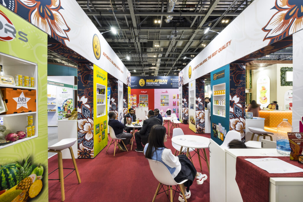
The Hidden Friction Within Exhibition Spaces
When you give it some consideration there can be a lot of subtle friction within exhibition spaces. A raised platform might look premium, but if someone has to stop and think before stepping onto your stand, you’ve already interrupted the interaction. If the colour on the edge isn’t bold enough it is easy to cause people to trip which isn’t the best experience with your brand. Tight furniture layouts might maximise space on the design, but they can make stands feel uncomfortable, crowded or difficult to navigate or use. Low-contrast graphics might look stylish in a render, but on a busy show floor they become hard to read from a distance.
Exhibitions are high-pressure environments, people are overloaded with information, distracted, rushing between meetings and constantly making split-second decisions about where to spend their attention next so considering accessibility should be top of the design brief.

What an Accessible Exhibition Stand Should Feel Like
Interacting with your stand should feel effortless and inviting:
- You should be able to move through them naturally.
- You should immediately understand where to look.
- The messaging should be clear and readable with a sensible contrast.
- The interaction should feel comfortable.
- Nothing should feel intimidating or confusing.
- The step up onto the stand should be clear.
- There should be a slope to the edge of your stand if you can avoid it being a step.
That’s accessibility in a nutshell.
Better Accessibility Often Means Better ROI
The interesting part is this: the same decisions that improve accessibility often improve engagement and ROI too.
- Clearer graphics help people absorb messaging faster.
- Wider entrances invite more footfall.
- Open layouts encourage visitors to join a busy stand.
- Lower counters create easier conversations.
- Defined spaces improve interaction quality.
- Considered navigation improves stand flow during peak times.
This isn’t about watering down creativity at all or making every stand look the same. It’s about designing experiences around real human behaviour and the easy of your attendees instead of just aesthetics.
Where to Start With Accessible Stand Design
So where should you start?
The simplest way is to stop thinking about accessibility as a compliance checklist and start thinking about it as part of the visitor experience.
Ask simple questions early in the design process:
- Can people enter the stand easily from every angle?
- Is there enough space for visitors to move comfortably?
- Can someone understand our message within a few seconds?
- Are text and logo graphics readable from distance?
- Are key touchpoints accessible to everyone?
- Does the space feel welcoming or intimidating?
- Where could visitors hesitate, slow down or disengage?
Those questions alone usually improve a stand dramatically.
Practical Ways to Improve Exhibition Stand Accessibility
There are some very practical changes you can make immediately.
Reducing or removing raised flooring is a big one. Not only does it improve accessibility, it often creates a more open, seamless connection between the aisle and the stand itself, which naturally increases approachability. If you need a platform, aim for a sloped edge or really defined edges.
Think carefully about counter heights and interaction points. If everything is designed for standing conversations, you automatically limit who can comfortably engage with your team.
Graphics are a huge opportunity. Exhibition halls are visually noisy environments, so clarity wins every time, ensure you have a strong contrast, clean typography and simple messaging – it nearly always outperforms over-designed visuals when competing for attention.
Don’t underestimate the impact of space planning too. There is no need to squeeze everything into your footprint. Be ruthless with your decision on what the stand is there to do, don’t try to do it all at once and overwhelm the audience. People need space to pause, process and interact naturally, especially during busy periods when stands become crowded and movement patterns change throughout the day.
Accessibility and Commercial Performance Go Hand in Hand
Accessibility and stand performance are becoming connected conversations, accessible stands tend to perform better commercially too. They create better flow, better conversations, stronger engagement and more comfortable visitor experiences.
And that’s what we help brands do, be bold and stand out for all the right reasons.
For great stand designers, accessibility isn’t a limitation on creativity. It’s part of what makes great exhibition design work in the first place.
At Tecna, we handle your exhibition from start to finish, including everything to do with health & safety and accessibility.