The exhibition industry has a long-standing habit of treating accessibility as a compliance issue. It becomes a checklist of requirements to be satisfied at the end of the design process, rather than a design principle embedded at the beginning.
This approach produces stands that technically meet minimum standards while failing many of the visitors they are supposed to engage. It also misses a commercial reality. Accessible design is not a concession to a minority of visitors. It is better design for everyone.
The Scale of the Accessibility Gap
Nearly one in four working-age adults in the UK has a disability or long-term health condition, which means a significant share of the visitors at any show may experience your stand very differently from the way it was drawn.
The assumption that accessibility considerations apply to a small edge case on the show floor is not supported by the data. At a show of 4,000 attendees, close to 1,000 are likely to have some form of disability or condition that affects how they interact with a physical environment.
Beyond formally declared disability, a much larger proportion of visitors have temporary or situational limitations that good accessible design also addresses. This might be someone on crutches following an injury, a visitor managing fatigue from a chronic condition that is not formally disabling, or a person with visual processing differences that make dense or cluttered environments hard to navigate. Accessible design that serves these visitors also serves the broader population more effectively.
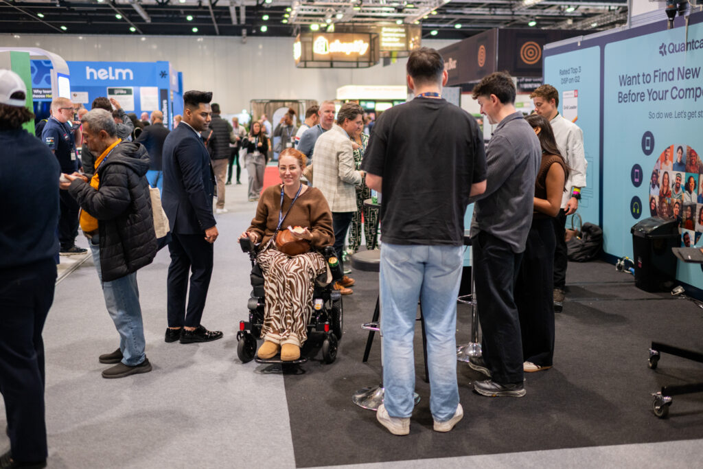
What Inaccessible Stand Design Actually Looks Like
The barriers that inaccessible stand design creates are often invisible to designers and marketing managers who do not experience them personally. A stand with a raised platform entry point excludes wheelchair users and people with limited mobility.
A stand where all significant information is printed at standing eye height excludes seated visitors. Narrow internal pathways between displays are common in dense product showcase stands. They are impassable for wheelchair users and difficult for people with pushchairs or mobility aids. A stand where the primary engagement mechanic requires standing at a touchscreen for a sustained period excludes visitors for whom sustained standing is uncomfortable or impossible.
Noise levels, lighting intensity, and visual complexity are a separate category of accessibility consideration. They affect visitors with sensory sensitivities, hearing impairments, and cognitive differences. A stand that uses very loud ambient music or very bright strobing lighting may be creating a sensory environment that is genuinely hostile to a proportion of its target audience.
The Business Case for Accessible Design
Accessible stand design is the right thing to do, but it is also commercially sensible. Making the business case alongside the ethical one tends to produce better outcomes in real briefing conversations. Visitors who can comfortably access and engage with a stand spend more time there.
Visitors who feel welcomed and accommodated have a more positive brand association. Visitors who encounter barriers leave faster, whether they articulate those barriers or not. They remember the friction rather than the proposition.
There is also a reputational dimension that is increasingly commercially significant. Brands that are evidently thoughtful about inclusion in their physical presence signal something about their values. That signal resonates with a growing proportion of both buyers and employees. Some organisations have made public commitments on inclusivity and then exhibit with a physically inaccessible stand. This creates an uncomfortable inconsistency that increasingly sharp observers will notice.
What Accessible Stand Design Actually Requires
The practical requirements of accessible stand design are not as constraining as they’re sometimes perceived. Many of the changes that dramatically improve accessibility have little or no impact on the visual impact or commercial performance of the stand. Some actively improve both.
Level or ramped access, rather than raised platforms, is a straightforward structural decision that affects every visitor’s ease of entry. Clear pathways of at least 900mm width through the stand interior are both an accessibility requirement and a basic good design principle for visitor flow. Information presented at multiple heights, not just at standing eye level, serves seated visitors. It also tends to create more visually interesting graphic design. Seating options within the stand serve visitors who cannot stand for sustained periods. They also create dwell time for everyone else.
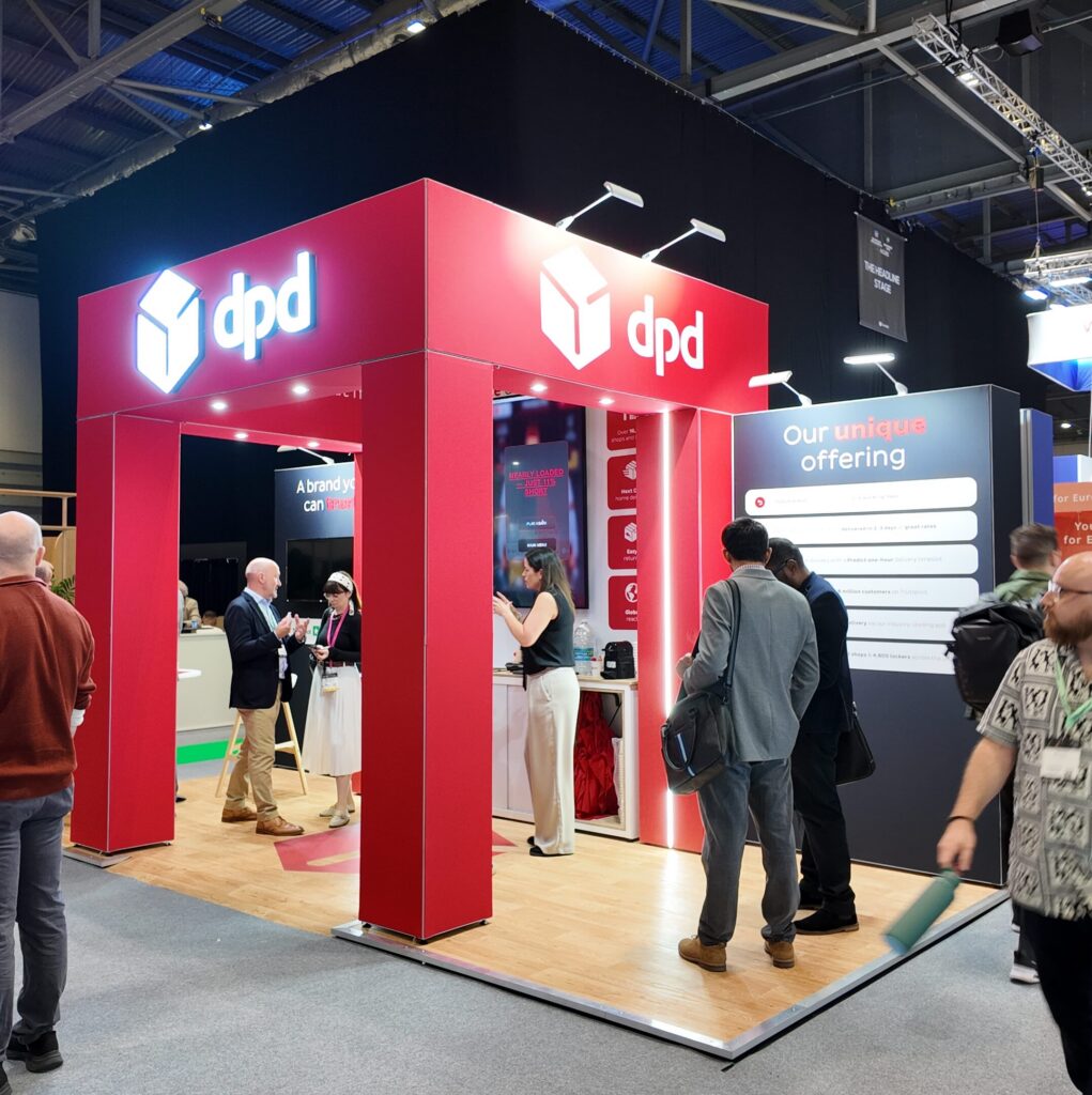
For interactive elements, there are three questions to ask. Can the interaction be completed from a seated position? Does it require two-handed operation that some visitors will find impossible? Is there an alternative engagement option for visitors who cannot use the primary mechanic? These questions improve the design for everyone, not just for visitors with disabilities.
How to Accessibility into the Brief
The most effective way to embed accessibility in stand design is to make it an explicit brief requirement from the outset, rather than a review criterion applied to a finished design. A brief might state that ‘all visitor interactions must be accessible from a seated position’ and ‘internal pathways must be at least 900mm wide’. This gives the design team parameters within which to work creatively, rather than constraints applied after creative decisions have already been made.
At Tecna, we advocate for accessibility conversations at the brief stage on every project. The stands that work best for the widest range of visitors are also, consistently, the stands that work best commercially. That is not a coincidence.
Shape your next brief with us today! Contact Team Tecna: https://bit.ly/3VjNFfI